Common TV UI Concepts and Components
📺
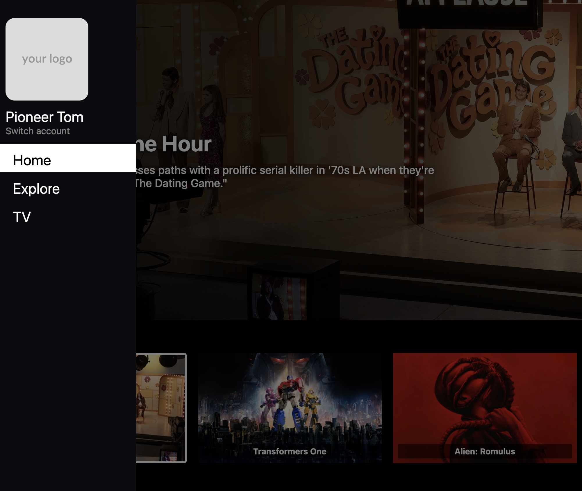
TV apps follow specific UI patterns optimized for what’s known as the “10-foot UI” - a design principle based on users viewing and interacting with the interface from about 10 feet away. This viewing distance, combined with remote control navigation, creates unique requirements for TV interfaces. Elements need to be larger, text must be more readable, and navigation patterns must be simpler than in mobile or web apps. Let’s explore these essential UI concepts and components used in TV app development, all designed with this 10-foot viewing experience in mind.
Core Components
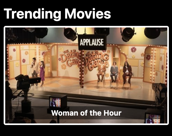
Cards

🎴
const Card = ({ title, image, onSelect }) => {
  return (
    <SpatialNavigationFocusableView onSelect={onSelect}>
      {({ isFocused }) => (
        <View style={[styles.card, isFocused && styles.cardFocused]}>
          <Image source={image} style={styles.cardImage} />
          <Text style={styles.cardTitle}>{title}</Text>
        </View>
      )}
    </SpatialNavigationFocusableView>
  );
};

const styles = StyleSheet.create({
  card: {
    width: scaledPixels(200),
    height: scaledPixels(300),
    margin: scaledPixels(10),
    backgroundColor: '#2c3e50',
    borderRadius: scaledPixels(8),
    transform: [{ scale: 1 }],
  },
  cardFocused: {
    transform: [{ scale: 1.1 }],
    borderColor: '#3498db',
    borderWidth: 2,
  }
});
Key Considerations:
- Clear focus states
- Smooth scale animations
- Consistent sizing
- Readable text
Best Practices
Focus Management
🎯
- Implement clear visual feedback
- Create predictable focus patterns
- Ensure smooth transitions
Navigation
🎮
- Optimize for remote control
- Minimize required clicks
- Provide clear back navigation
Visual Design
🎨
- Maintain clear hierarchy
- Use appropriate contrast
- Scale for viewing distance
Performance
⚡
- Implement virtualization
- Optimize animations
- Efficient asset loading
Accessibility
♿
- Use readable text sizes
- Ensure high contrast
- Provide clear indicators
✅
Implementation Checklist:
- Components scale appropriately for TV screens
- Focus management is intuitive and smooth
- Navigation works well with remote control
- Performance is optimized for TV hardware
- UI is accessible and readable from a distance
💡
Remember to always test your UI components on actual TV devices to ensure they provide a great user experience in a real TV environment.

